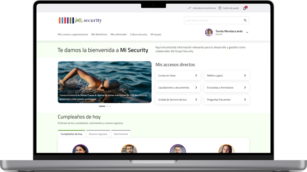
My Security is a corporate intranet and support tool for the management, performance and consultation of tasks required for different user profiles of the Security Group companies.
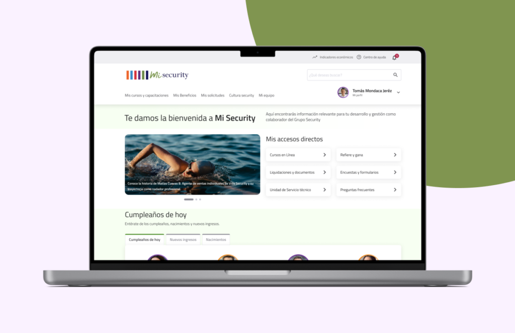
The Problem
There are many repeated requests from users who make use of the intranet about where to find certain material, they do not know how to get to the mandatory training courses. There are a high number of incidents associated with where and how to consult the benefits that correspond to each person or group of companies.
The interface is not very intuitive, which makes it difficult for the user to understand.
The Solution
The design team proposed an improvement based on the user’s needs and pains, aligned with business expectations and available resources. Finally, improvements were proposed by prioritization, creating a more intuitive, clean, responsive and adapted to each user profile.
The most important part of the proposed solution is that the needs of each profile were identified, optimizing access to what is really important and frequently used, identifying the most attractive and discarding what was less used or did not add value to perform their tasks on a daily basis.
Client
Security
Tools
Figma, Miro, Excel
Role
UX Designer on a team of 3.
Duration
8 weeks: February & March 2024
The importance of an efficient UX Strategy
Having a strategy well aligned with expectations and time scope is crucial to ensure that the final design is not only intuitive and satisfying for users, but also delivered on time, optimizing resources and avoiding costly rework or last minute adjustments. After the Kikoff session, the work plan was defined to optimize our strengths in each phase of the design process.
The Process
1. Research
Knowing that we needed to improve the user experience of the intranet we jumped straight into it to find out what it was like to use it and what features it offered.
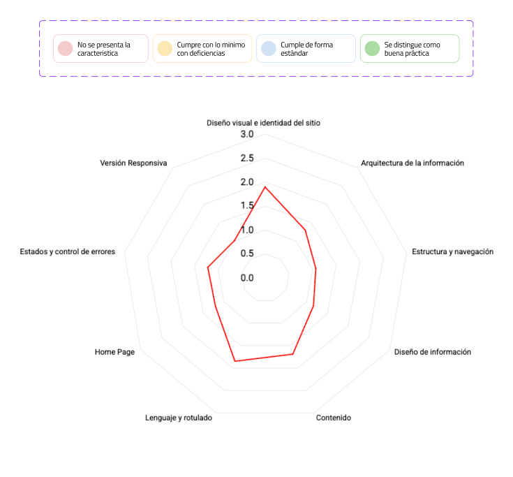
a. Heuristic Analysis which allowed us to identify usability issues and areas for improvement of the interface.
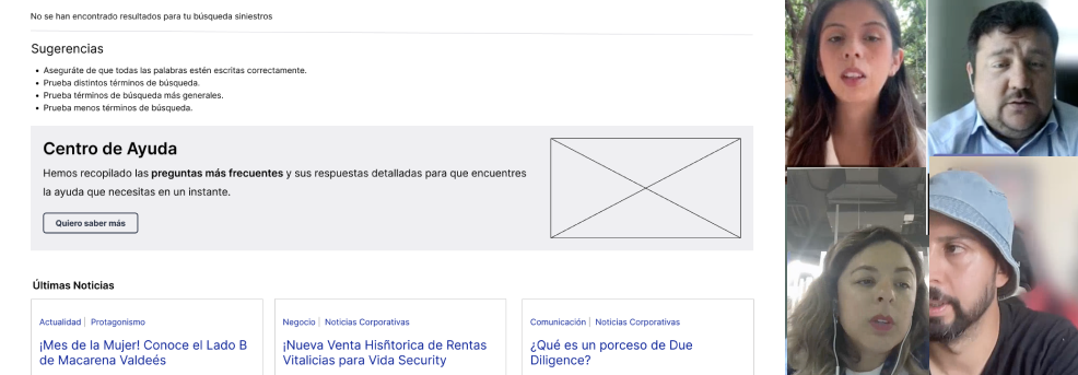
b. User interviews to understand users’ needs, wants and challenges with the product, which gave us direct and detailed information on how to improve the user experience. We delved into perceptions, behaviors and opinions, guiding user-centered design.

2. Empathize
After conducting the interviews, 20 in-depth interviews were analyzed to identify common patterns and themes. This allowed me to group users into segments based on their behaviors and needs.
2.1 General Learnings
Most of the participants access and visit Mi Security with the need to perform tasks related to their positions or due to a transactional request such as taking mandatory courses.
- 90% of users have never used the shortcut menu within the main menu.
- On the top nav there were options such as: santoral, weather, date, for the users and the only one that is useful for the users is the one of the economic indicators.
- 80 % of users are unaware of the existence of the FAQ section and the Help Center option found in the Home page has gone unnoticed by most of them.
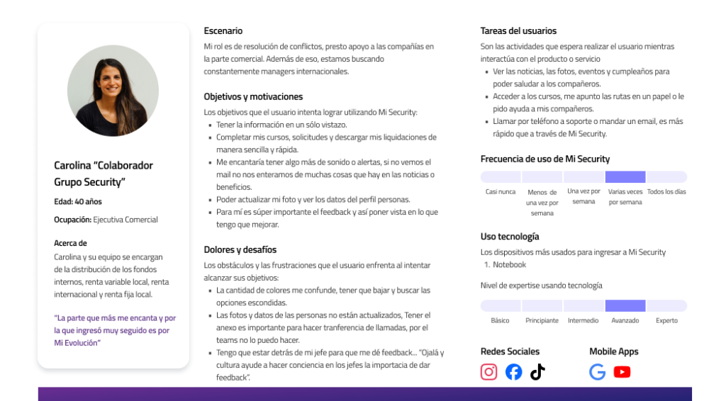
2.2 Persona
The user persona was easy to create after our analysis of the research, initial client sessions and using the intranet in various profile modes. With the user persona the team could empathize more with the end user.
Three profiles were created:
- Manager Profile
- Presential Worker Profile
- Administrative Profile
Administrative
3. Ideation
3.1 Site Map
The sitemap is always important: it gives designers a panoramic view of the product and shows how pages are prioritized, linked and labeled.
I performed the inventory of the current website, thus identifying improvement opportunities for the new navigation to be evaluated through tree testing.
3.4 Design Decisions
The results of the research were presented to the business team and actionable items associated with the most relevant findings.
Based on an effort vs. impact matrix, the prioritization of those functionalities that needed to be addressed in the short, medium and long term was carried out. This activity was carried out together with the Design, IT and Business team.
4. Design
4.1 Wireframing
I was in charge of wireframing. Before starting I reviewed everything that had been created so far: sitemap, personas, interview findings and heuristic analysis. Communication with the team and client was efficient at all times, the process was wireframe > iterate > re-wireframe.
Together we went through 3 rounds of iterations before the wireframes were approved.
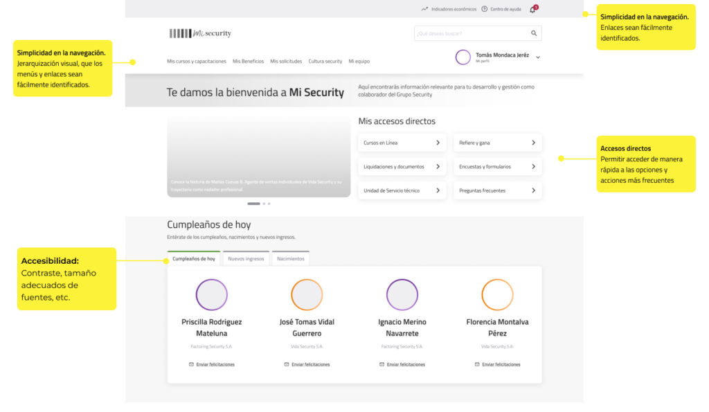
Una mirada más cercana de algunos wireframes finalizados
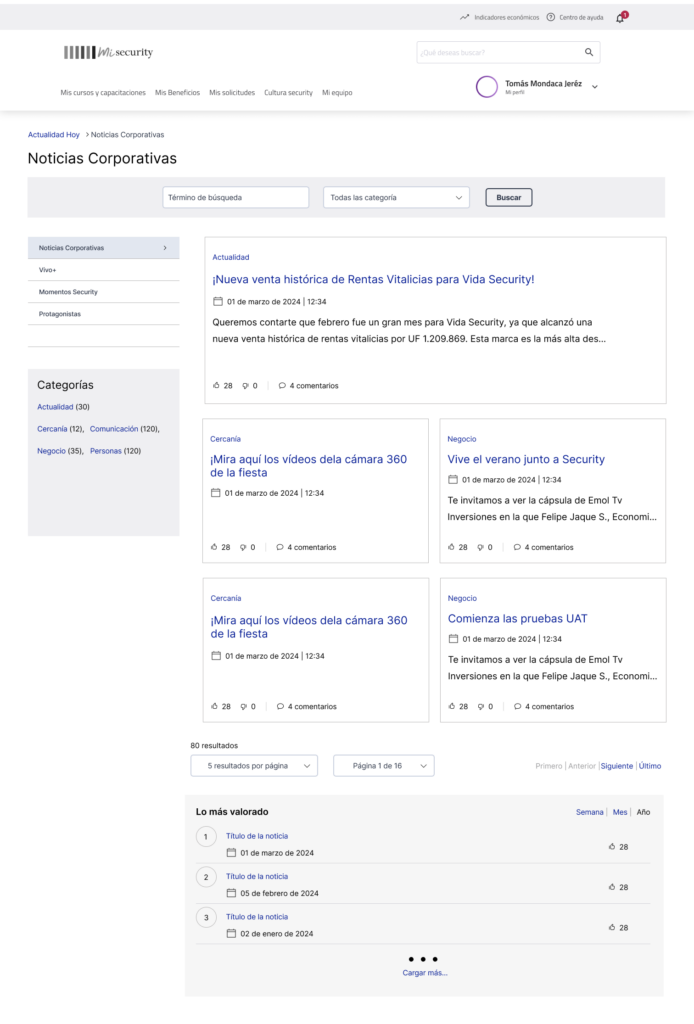
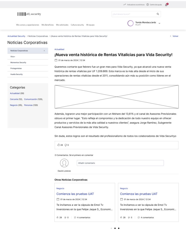
4.2 UI Design
Within the client’s design team they already had their own Style Guide. Grupo Security’s component kit had to be taken into account. Ensure that the user interface elements could work with Grupo Security’s system, aesthetically and functionally.
5. Prototyping and Testing
The moment of truth is approaching: let’s test it. The guidelines were left for the next steps since our collaboration was focused on the research stage and the expected deliverable was a wireframe-based improvement proposal to be implemented by the client’s internal design team.
6. Take away
Mi Security has an excellent valuation by the user, it generates positive sensations to be informed, closeness with colleagues and continuous professional improvement. All this has a direct impact on the desirability of updating and ease of use to complete their tasks in an agile way.
Intuitive recognition
Helping users to recognize interface elements without the need to analyze them in detail, wasting more energy and time.
Visual and content architecture optimization
Improve the layout of elements and content based on needs and frequency of use.
Consistency and predictability
Reducing Confusion and Uncertainty, which are known in advance if they are going to be redirected to external platforms.
Here is a quick before and after view


 English
 Español